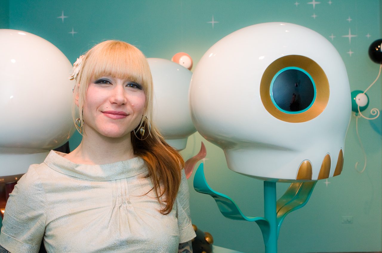
In the 10 years since I ran this interview, Tara McPherson has become a worldwide art icon and one of the most down-to-earth and hardworking artists out there today. Last year, she designed a sick series of limited posters for the New York dates of Faith No More’s reunion tour and I was lucky enough to get a hold of one. The image features her familiar missing heart girl, Orian, firing laser beams from her eyes. There’s just something amazing about an artist who still finds time to design a kickass rock poster while selling out galleries around the world.
This interview was originally published in Life In A Bungalo on August 17, 2006
To outsider and pop art fans, Tara McPherson is the master (or is it mistress) of cartoon imagery and is single handedly making it cool to have posters of sad girls with missing hearts hanging on your wall next to your Andy Warhol prints. I got the chance to chat with Tara about the resurgence of poster art, dabbling in vinyl toys and her book “Lonely Heart: The Art of Tara McPherson.”
Could you give a little bit of history as to how you got into poster rock art? Maybe how you got into art in general?
I always knew I wanted to be an artist, having gone to art magnet schools since the 7th grade, but I never had planned on doing rock posters for a living — it just kind of happened. Music has always been a big part of my life.
I started collecting records and posters at a pretty young age and played bass since I was 15. After I graduated from Art Center, I finally had time to be in a band. Since I was the artist in the band I got the job of making our flyers. My posters grew from little black and white xeroxes to more thought out color posters. Then I then started doing them for friends bands and for the Knitting Factory L.A. and it all grew from there. At first I was very set on being a painter and didn’t want to even put any of my rock posters on my website, but after I had a good amount I decided to make a section for them.
When I started looking at my site statistics, I realized that the posters were getting more hits than my paintings were. Well, the proof is in the pudding, and it was then I realized that posters are really great things to create, and there is a big interest in them within the art world.
For a while it seemed like the rock poster was dying art form, but now it’s pretty huge again. What do you think attributed to its resurgence and why do you think it’s survived all these years?
Poster Art has always been around in some form or another throughout history but its popularity wanes and ebbs. We are just experiencing a high point again. As far as it’s current resurgence, I think the rise of the Internet and awesome websites like GigPosters.com have helped ease accessibility. It brings the world closer and spreads information across continents in the blink of an eye. Also, new books like “The Art of Modern Rock” and “Swag” are helping promote and sustain peoples’ interest with a tangible item.
There are so many diverse and talented artists doing posters now too, like Jay Ryan, Dan Grzeca, Brian Ewing, Aesthetic Apparatus, Leia Bell, Print Mafia, Little Friends and others. It has become a new movement and a force in the current art world. There are simply more rock posters being made now than ever before, which in turn means more posters are being sold at concerts people go to, and more posters are in peoples’ homes, which is fantastic.
What bands are your favorite to work with and how do you actually go about using limited/signed posters to promote shows? I assume the limited ones aren’t stapled to concert halls.
You’d be surprised! Sometimes they are stapled up and sometimes the people that work at the venue keep them and never even put them up. The average situation though is that the venue gets 10 to 20 posters around two weeks prior to the show to use as promotional posters. The band gets between 10 to 50% of the entire run to keep and sell as merch, and I keep the rest to sell on my website. That varies from job to job though.
Sometimes, I’ll do a poster for a friend’s band for free, like with Isis, so I’ll give them 50 posters and keep the rest. But if it’s a paying job and they need more for merch, I get a higher art fee and give the band more posters. Each situation is different because sometimes I work directly with the band, or other times it’s through the management, the venue or the booking agent.
I have never really had a bad experience with a band ever; mostly all are super awesome to work with. That’s the great thing about rock posters — I’m happy, the band’s happy, the fans are happy. It’s a really great situation. I also get the opportunity to try new things with posters, stylistically and technically that I might not do with a painting. Paintings take longer to do and are more planned out. I feel like with the posters, there is room for the freedom to experiment because there is an inherent sense of frivolity with them. They’re rock and roll.
You also seem to have an affinity for comic book art. What have you worked on and how different is comic design from poster design?
Comics are another thing I was super interested in when I was younger that I never thought I’d be doing. The past really does write the future. It was fate I think. Shelly Bond, an editor at Vertigo DC, saw in interview of mine in International Tattoo Art and asked me for a press kit. Right after I sent that in they gave me my first cover, which was for Lucifer. Then I worked on more painted covers for Sandman Presents: Thessaly, and The Witching.
As life progresses and new challenges get presented. I was asked to create art for the interior pages. I jumped at the chance and I just finished my first painted comic for a new Fables hardcover graphic novel that is coming out in October. That is a 14-page short story. And now I’m starting on a 100-page painted comic called Donor, written by Stephen T. Seagle (American Virgin, It’s a Bird, House of Secrets) for Vertigo.
As far as similarities and differences go, I would say the comic covers are somewhat similar to posters, in that they share the goal of attracting a viewer with a central image and theme. But the interior pages that I have begun painting are a whole different world. It’s a completely new situation for me, which I like — I love a challenge, aesthetically and conceptually, of which these new projects have provided in spades.
Could you tell me the story behind your missing heart girl? It has become quite synonymous with your style?
That’s me working out my personal issues through my art. It’s my catharsis and is a necessity for me to maintain my sanity as a caring human being. Some people write poems, some write songs, I work it out through my drawings and paintings. That was the original conception of her, but now she has evolved into a character I call Orian.
I’m always trying to place her in different stories and work out new things for her. Sometimes friends will be going through a fight or a break up and I’ll get inspired to create something from that heartache as well. Whether it’s your own or your friends, it’s deep and painful, and for me, it hits me on a level where I have to create something to work through it or help someone else work through it.
Take for instance the illustration used in my Depeche Mode poster. I knew I wanted that pose, but I needed some extra and interesting element to put in there. Well a friend was over fighting with his girlfriend and the image of the black tears just came as an epiphany and I knew it was the perfect addition to the image. I feel it really captures that moment of desperation — trying to figure out love and life — but with an air of confidence. I think all my girls, no matter how sad they appear, are determined and strong.
Do your designs necessarily represent the bands or are they just your interpretation of their style?
It’s definitely my interpretation of their music and style, but it’s very important to nail that. To create something that totally suits their band and will appeal to the fans. Sometimes that’s easier than others, which is why now I pretty much only do posters for bands I really like. It’s more fun and I feel closer to the music. One thing with rock posters that I love is that I never get art directed — I have complete creative freedom to do what I want, which is how I work best.
What the process from when a band asks you to make poster for them to the final product?
The way the process of doing a poster goes for me is I start by writing down words and ideas to get a good concept going and then I start doing doodles to figure out the characters and placement of things. Then I scan my rough and blow it up to the size I will draw it at. I’ll trace the rough onto smooth Bristol. I like tracing my rough drawing because there is a certain looseness in it that is lost when you just redraw it from looking at it. Then I finish my final drawing and scan that. I’ll then do the color separations in Photoshop where each color is on it’s own layer. From there I send the file to my printer and he outputs films for each layer. Each layer then gets burned to a screen and is printed in succession until the poster is done. Wallah.
How hard was it to translate your style to the 3D world? For instance how did you tackle your Qee, Dunny and Circus Punk?
It wasn’t hard for me to conceptualize them, but it was kind of weird designing in Illustrator. I rarely use that program, so that took some getting used to. But other than that, it’s easy for me. I see most of my characters as objects in my head already, so I think they’re all just begging to made.
What has your reaction been to the fans of your work? It was pretty crazy watching the people swarm over your work at the KRNY opening. Is it like that all the time? Is it overwhelming?
Ha! No, no, it’s only like that at the events. Normally it’s just me and my intern at my studio working. It’s a very solitary job and most of the time I’m alone. That’s why I love doing those events. I get to hang out with people. I like to look at it as a reward for working by myself all the time. I get a few hours here and there where it doesn’t feel so lonely. It does get a bit overwhelming when I do the big long events though; say like the San Diego Comic Con, where I’m there for nine hours a day for like five days in a row. Everyone is so very cool and nice though; it’s awesome and makes my heart swell when I meet fans.
What advice would you give to kids who are making their own DIY flyers or posters?
Keep doing it. And experiment with new things as much as you can, whether it is conceptually, illustratively or with different papers or printing methods.
Finally, what does the near future hold for Tara?
Well my first art book called “Lonely Heart: The Art of Tara McPherson” published by Dark Horse Press comes out September 6. I’m so very excited about that. I will be doing a month long European book tour to support it as well as some signings. The Fables: 1001 Nights of Snowfall story I worked on comes out in October. I have a bunch of toys in production with Kid Robot now. Other than that, I’m going to spend the next year painting “Donor,” painting for gallery shows, doing freelance illustration and posters, and designing more toys. Also I teach a Concept Illustration class once a week for 3rd year students at Parsons in NYC. I think that should keep me pretty busy… maybe.

Tara freaking rules. ! -CP in da house!
Thanks Tara for being so kind at SDCC.
JK